Writing Task 1 sẽ yêu cầu bạn miêu tả, phân tích các dạng biểu đồ, bản đồ hay quá trình trong khoảng 20 phút với số lượng từ tối thiểu 150 từ.
Các dạng trong IELTS WRITING TASK 1:
1. Bar chart
2. Line graph
3. Table
4. Pie chart
5. Diagram or process
6. Map
7. Combination of the above (multiple tasks)
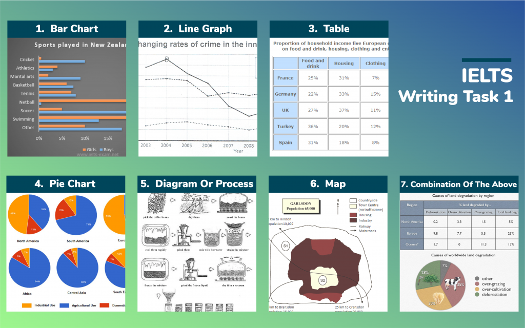
The chart gives information about the most common sports played in New Zealand in 2002. Summarise the information by selecting and reporting the main features, and make comparisons where relevant. Write at least 150 words.
? ️? ️?
The bar chart compares the proportion of boys and girls who participated in various sports in New Zealand in the year 2002.
Overall, it is apparent that there were significant differences in the percentage of boys and girls who took part in most of these sports, whereas basketball and tennis experienced a similar figure in both genders.
Among girls, the most common sports were netball and swimming which made up over 25% and 23%, respectively, followed by tennis, basketball, athletics, which all had the figure of under 10%. By contrast, cricket and modern arts were the least common activities chosen by girls, which represented a mere 1% and 2% in that order. Finally, 10% of girls took part in other activities.
When it comes to the figure for boys, the sports with the highest participation figure were soccer, swimming, and cricket with 25%, 13%, and 12%, respectively. Meanwhile, martial arts, basketball, tennis were in the next position which all had the figure between 8% and 11%. In a stark contrast, the most striking feature can be seen from the chart is that fewer boys participated athletics and netball than girls did which were only 3% and 1%, compared to 5% and 21% of girls in that order. About 18% of boys played other sports.
215 words
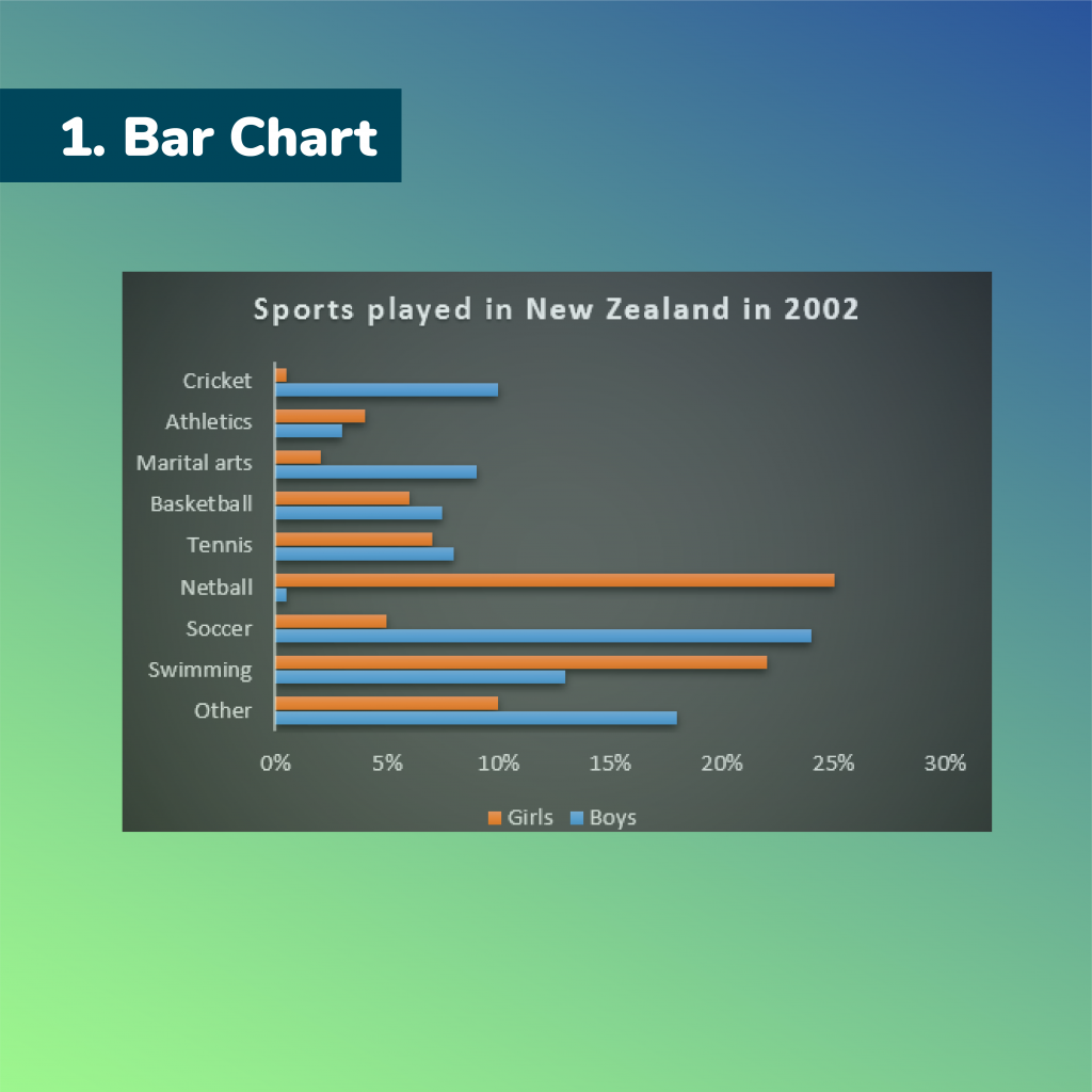
The chart shows the changes that took place in three different areas of crime in New Port city center from 2003-2012. Summarise the information by selecting and reporting the main features, and make comparisons where relevant.
? ️? ️?
The line graph illustrates the fluctuation of crime rates in three various types in Newport city over the period of 9 years, from 2003 to 2012.
Overall, all kinds of crime experienced frequent changes over 9 years with different levels. While the rates of car theft and robbery fluctuated slightly during the 9-year period, the number of incidents reported due to burglary saw a significant downward trend.
In 2013, starting at the point of nearly 3500 incidents, the figures for burglary reached its peak at approximately 3750 incidents in 2004. The following 4 years followed by a sharp decline before hitting its bottom of around 1200 incidents. The rates of burglary in the remaining period increased a little bit and remained nearly unchanged around the point of 1400 incidents.
Theft relating to cars stayed constant in 2 years at about 2800 incidents before its sudden drop in 2006 to just above 2000 incidents.. The rest of time witnessed a gradual increase to nearly the same level in 2003, 2750 incidents. There was a significant change that could be seen from robbery the type of crime which had the lowest number of incidents, at around 650 incidents.
196 words
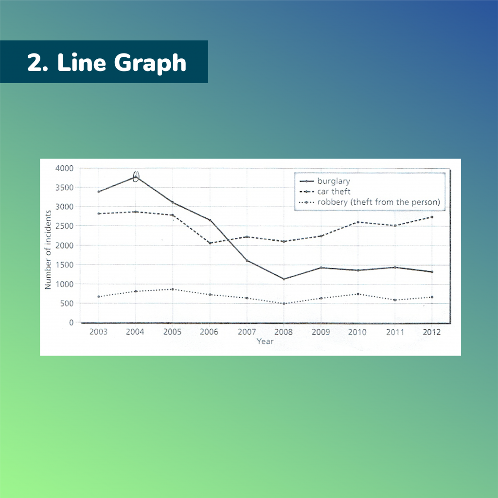
The table illustrates the proportion of monthly household income five European countries spend on food and drink, housing, clothing and entertainment. Summarize the information by selecting and reporting the main features and make comparisons where relevant. Write at least 150 words.
? ️? ️?
The table shows the data on the monthly expenditures of people in five European nations on different categories.
Overall, food and drink and as well as housing accounted for the biggest expenses of these countries while the smaller ones are spent on clothing and entertainment.
The group of countries including France, Germany, and the UK invests the largest portion of their monthly income on housing with 31 percent, 33 percent and 37 percent respectively. Meanwhile, a smaller one is used for food and drink. In contrast, the other nations namely Turkey and Spain allocate more for food and drink whereas housing is less preferred by them. In detail, the numbers of Turkey are 36 percent for the former and 20 percent for the latter. Likewise, food and drink, in Spain, accounts for 31 percent of the income, but only 18 percent is spent on housing.
The spending on entertainment is higher than that on clothing in France and Spain. The proportions are around 15 percent and 8 percent respectively. Similarly, 19 percent of German citizens’ budget is used for entertainment, compared to 15 percent for clothing. Moreover, Britain and Turkey see a similar number of these two categories, at about one-tenth of the monthly income.
205 words
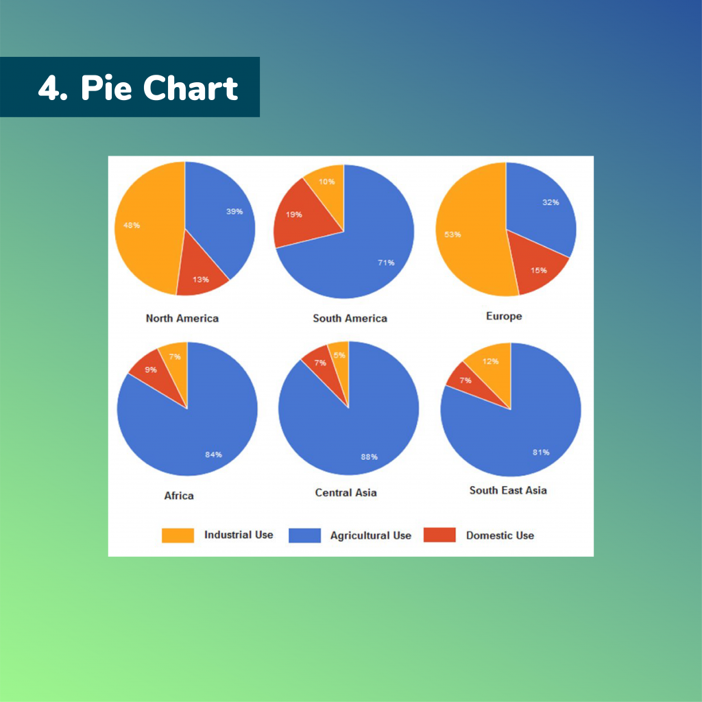
The charts show the percentage of water used for different purposes in six areas of the world. Summarise the information by selecting and reporting the main features, and make comparisons where relevant.
? ️? ️?
The pie charts compare the proportion of water consumption for industry, agriculture, and domestic purpose in six separate regions of the world.
Overall, it is clear that water used for agriculture accounts for the largest proportion, except for North America and Europe, mainly providing for industrial use.
With regard to agricultural use, Central Asia is the area that uses the greatest level of water, at exactly 88%, followed by the figure for Africa and South East Asia, at 84% and 81% respectively. South America needs a smaller rate, with 71%, compared to one-third of the total consumption in Europe.
In contrast, Europe area primarily uses water for industry, making up the highest percentage among the remaining regions, over a half of the total. Likewise, 48% of water is prioritized this purpose in North America, contrasting to 10% of that in South America. A noticeable pattern is that all six areas use an inconsiderable percentage of water for domestic purpose, apart from South America, with 19%, being the most significant consumption level.
172 words
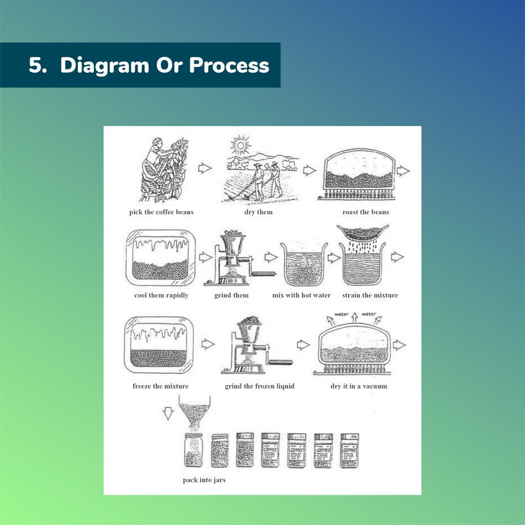
The diagram shows how coffee is produced and prepared for sale in supermarkets and shops. Summarise the information by selecting and reporting the main features, and make comparisons where relevant. Write at least 150 words.
? ️? ️?
The flow chart shows various stages of the production of coffee from coffee beans.
There are 11 main stages in the whole coffee making process, beginning with gathering coffee beans and ending with packaging coffee into jars.
Firstly, the coffee beans are picked and then are dried on filed under the sun. After that, the beans are roasted before being cooled at the fourth step. In this stage, the cooling process must be done rapidly.
At the next stage, those which are cooled are grinded and hot water is added to the beans at the sixth step. After the strain off the mixture, they are frozen rapidly. The next step is grinding the frozen liquid by using a machine. Afterwards, they are dried in a vacuum to evaporate the water and the coffee is made. The entire coffee-making process concludes after the coffee is packed into jars for customers.
152 words
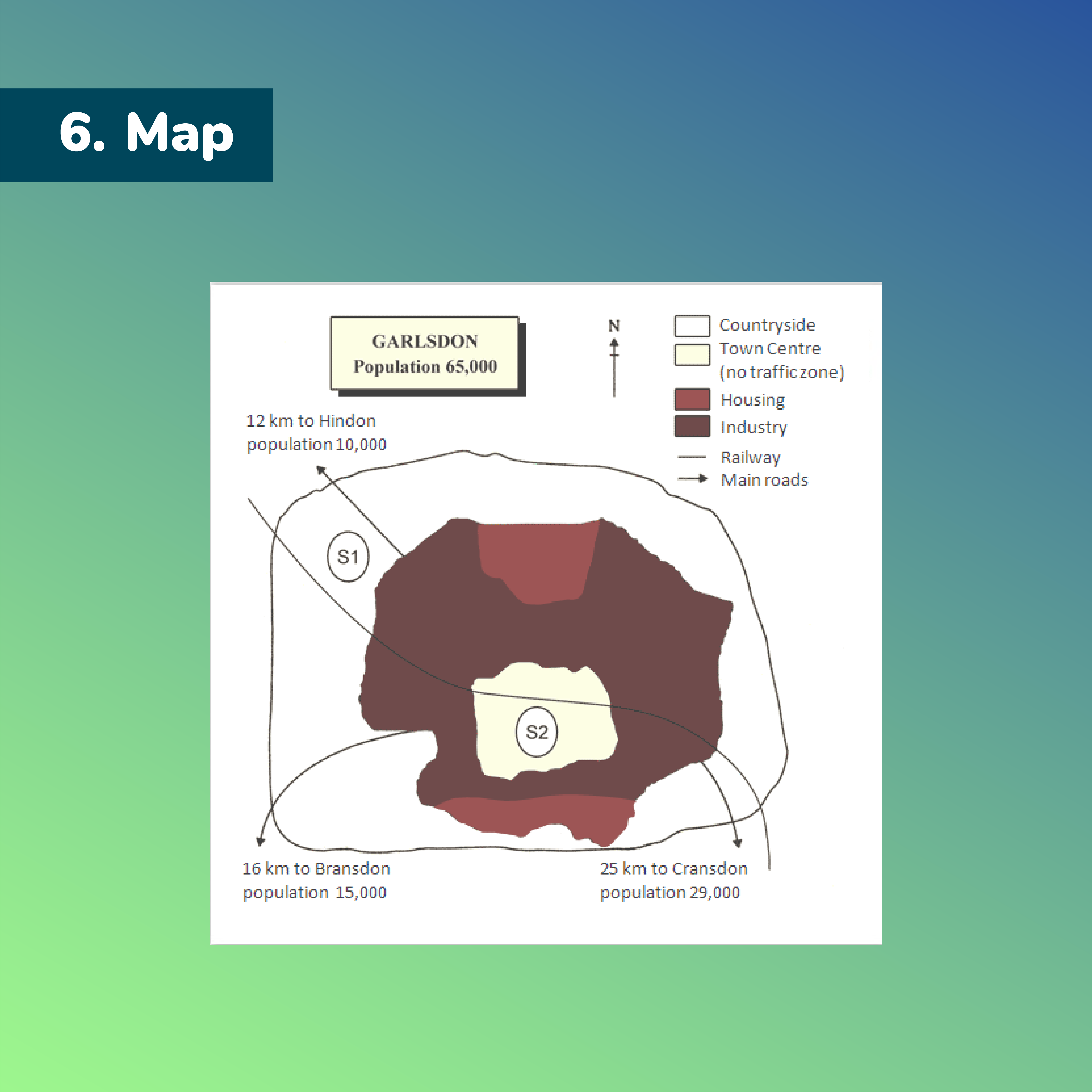
The map is of the town of Garlsdon. A new supermarket (S) is planned for the town. The map shows two possible sites for the supermarket.
? ️? ️?
The map shows two potential locations for a new supermarket in the town of Garlsdon.
It is clear that the main difference between the two proposed sites lies in their locations relative to three neighbouring towns, namely Hindon, Brandon and Cransdon. These areas are also compared in terms of access by road and rail.
Taking location into consideration, S1 is located close to the town of Hindon, which has a population of 10,000 people. However, it is quite far from two other residential areas, which are Bransdon to the southwest with 15,000 inhabitants and Cransdon, occupied by 29,000 people, to the southeast. By contrast, S2 has more advantages as it is situated right in Garlsdon town centre, where it is in the middle of the three mentioned towns.
As for transport infrastructure, Garlsdon had a railway line running through its centre from northwest to southeast, allowing customers to reach both S1 and S2, apart from residents of Bransdon town. While S2 is accessible to all the towns above by road, the pedestrian area where it is based prevents vehicles from entering the supermarket.
183 words
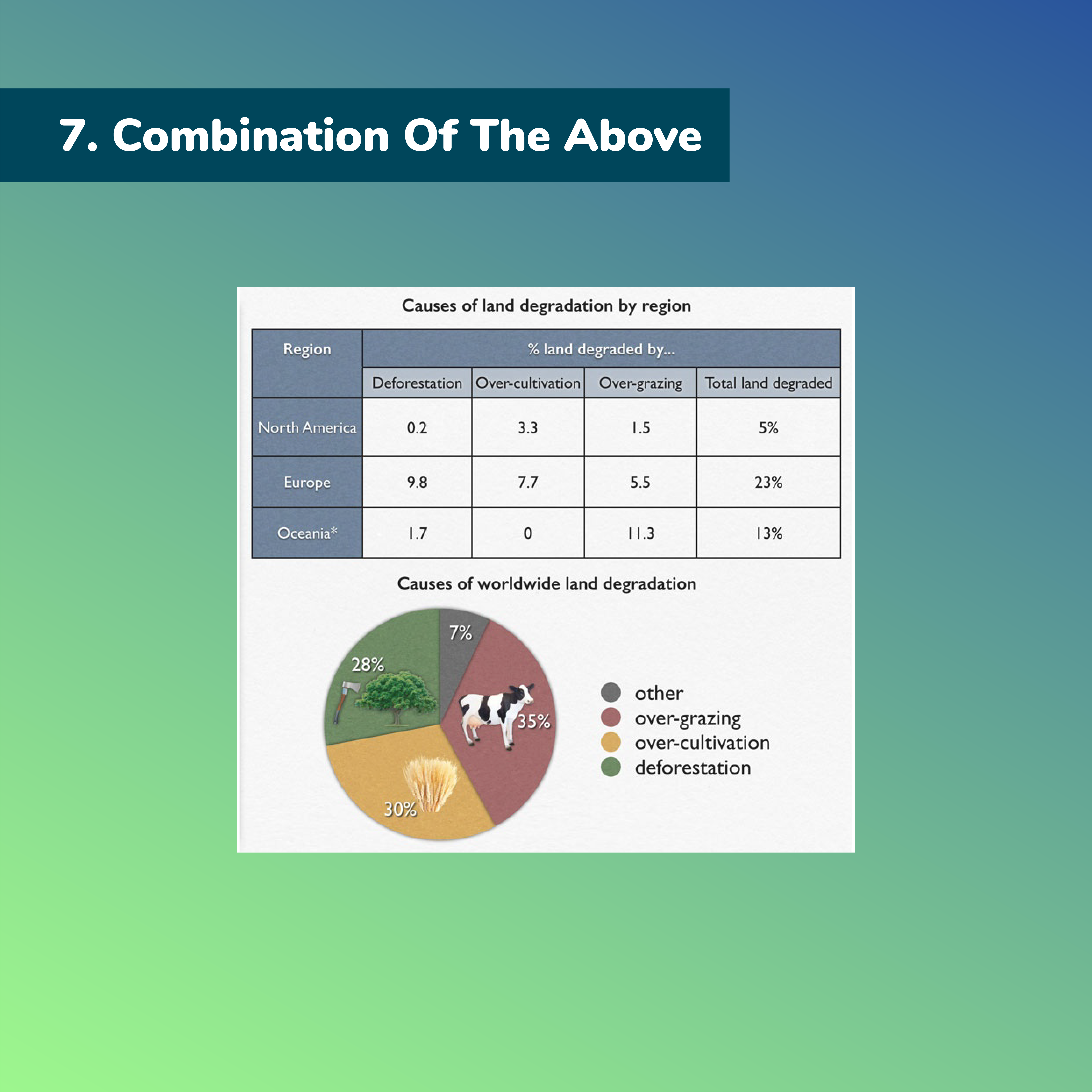
The pie chart shows the main reasons why agricultural land becomes less productive. The table shows how these causes affected three regions of the world during the 1990s. Summarize the information by selecting and reporting the main features, and make comparisons where relevant. Write at least 150 words.
? ️? ️?
The pie chart illustrates 4 main reasons caused the degradation of agricultural land. The table shows the percentage of land in three specific regions was affected by these causes in the year 1990.
Overall, it is clear that over-grazing was the primary factor causing degradation. Moreover, Europe was by far the region which was influenced the most in the total land degraded.
From the pie chart, over-grazing accounted for the largest proportion, at 35 %, which was the major cause leading to degradation. Meanwhile, the second most notable reason was deforestation (30%), which was slightly higher than the proportion of over-cultivation, by 2%.
According to the table, Europe had the highest rate of land degraded by deforestation with 9.8%, while the impact on Oceania and North America was minimal, at 1.7 and 0.2 respectively. In the data of land degraded by over-cultivation, 7.7% land of Europe decreased in the productivity and 3.3% North America experienced the same influence. Interestingly, over cultivation had no effect to Oceania. In contrast, Oceania had 11.3% of degraded farmland because of over-grazing. The figures for Europe and North America was lower, at 5.5% and 1.5% respectively.
190 words