Writing là một kỹ năng mà nhiều người cảm thấy “ngán” nhất trong bài thi IELTS. Nếu bạn đặt mục tiêu thấp, bạn có thể nâng cao các kỹ năng khác để kéo điểm Writing lên. Tuy nhiên, nếu bạn đặt mục tiêu cao hoặc đơn giản muốn đương đầu với nó thì bạn phải cải thiện kỹ năng này ngay từ bây giờ.
Để làm được điều này, bạn cần nắm vững cách làm từng task trong bài thi IELTS Writing cũng như luyện tập thật nhiều. Nếu bạn vẫn chưa biết nên luyện Writing IELTS như thế nào cho hiệu quả, hãy tham khảo bài viết dưới đây ngay nhé!
>>> Xem thêm: Khóa học ielts cho người mới bắt đầu
Luyện Writing IELTS như thế nào cho Task 1?
Bài Writing IELTS Task 1 yêu cầu người học phải nắm rõ các bước để hoàn thiện một bản báo cáo (report) dựa trên các số liệu được cung cấp qua các bảng/biểu đồ/hình vẽ. Mục đích của phần này là kiểm tra khả năng phân tích xu hướng và diễn đạt những xu hướng này theo hướng tăng/ giảm/ thay đổi một cách hiệu quả và chuyên nghiệp.
Một bài viết trong Task 1 thường có độ dài trung bình khoảng 150 từ, gồm 4 phần: Introduction, Overview, Detail 1 và Detail 2.
Bài mẫu phân tích
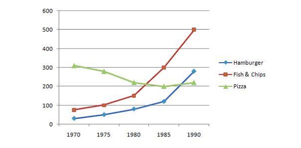
The line graph below shows changes in the amount and type of fast food consumed by Australian teenagers from 1975 to 2000. Summarize the information by selecting and reporting the main features and make comparisons where relevant. (Đề thi tham khảo trên IELTS-Exam.net).
 Biểu đồ phân tích
Introduction
Bạn hãy bắt đầu viết 1-2 câu mở đầu bằng phương pháp paraphrase – viết lại ý của câu hỏi bằng ngôn từ của mình. Phương pháp này giúp bạn viết phần mở bài nhanh chóng và dễ dàng.
Các từ thường được dùng để paraphrase trong Introduction:
The bar chart(s) = the bar graph(s) = the chart(s)
Show(s) = illustrate(s) = compare(s)
Figures for = number of
Between 1995 and 2000 = over the period of 5 years
In 2000 = in the year 2000
Theo ví dụ được cho ở trên, chúng ta sẽ có đoạn Introduction như sau: “The chart represents the weekly expenditure on three categories of fast food according to income groups in Britain while the line graph shows the total consumption of these fast foods over the period of 5 years.”
Overview
Đây là phần mà bạn phải nêu ra bức tranh tổng quan của bảng biểu đồ được cho. Bạn cần nêu ra những thay đổi hoặc những điểm chính của bảng biểu đồ chứ không đi vào chi tiết. Do đó, bạn chỉ nên viết một đoạn văn ngắn gồm 2 câu mô tả 2 đặc điểm chính và nổi bật trên bảng biểu đồ.
Các (cụm) từ thường được sử dụng để bắt đầu khi viết Overview:
It is clear/ noticeable from the chart/ table/ graph that….
As can be seen from the chart/ graph/ table, ….
As the chart/ table/ graph shows,…
As is shown from/ illustrated by the graph/ table,…
It can be seen from the table/ chart/ graph that…
In general/ overall,…
Overview cho bài mẫu phân tích: “Overall, it can be seen from the table that hamburger is the favorite fast food between high and average income groups and that its consumption has gotten a sharp rise over the time span of 20 years.”
Detail 1 và Detail 2
Sau khi đã hoàn thành xong Introduction và Overview, bạn sẽ viết 2 đoạn cho phần Detail, mỗi đoạn sẽ gồm 3-4 câu. Để có thể viết được phần này, bạn phải sử dụng phương pháp nhóm thông tin, tức là đi tìm điểm tương đồng và khác biệt giữa các số liệu có trong bảng biểu, rồi nhóm chúng lại với nhau. Tiếp theo, chúng ta sẽ viết cho mỗi nhóm một đoạn văn “detail paragraph”.
Quay lại ví dụ mẫu, chúng ta thấy biểu đồ thể hiện rõ hai nhóm khác biệt:
- Lượng tiêu thụ của Pizza giảm đáng kể (đường xanh lá).
- Lượng tiêu thụ của Hamburgers và Fish & Chips tăng mạnh (đường đỏ và xanh lá).
Đoạn Detail 1 sẽ viết như sau:
“At first, the bar graph shows the expenditure comparison among hamburgers, fish & chips and pizza. Hamburger is the highly consumed food in high and average income groups where it costs 40 and 32 pence per week respectively. Contrary, in low income group, more money is spent on fish and chips, around 17% which corresponds to the money spent on them in the high income group. Pizza expenditure has a gradual falling trend from high to low income groups which is 20%, 12% and 6% respectively.”
Đoạn Detail 2 sẽ được viết như sau:
“On the other hand, the line graph depicts that fish and chips were the highly consumed fast food in 1970, consumption 300 gms but with the passage of time, its consumption showed a gradual descending trend till 1990 when it reached around 200gms. While hamburger and pizza showed increasing trends, in which hamburger showed an abrupt rise and reached at 500 gms till 1990. Pizza consumption took a steep rise and could just reach at 220 gms which is the same as the lowest level of fish and chips consumption.”
Trọn bộ đề thi IELTS Writing Task 1
Sau khi đã nắm được cách làm bài, TOEIC IELTS HUY TRỊNH gửi tới bạn bộ đề thi IELTS Writing Task 1 để bạn có thể thực hành kỹ năng làm bài ngay lúc này.
Writing Task 1 sẽ yêu cầu bạn miêu tả, phân tích các dạng biểu đồ, bản đồ hay quá trình trong khoảng 20 phút với số lượng từ tối thiểu 150 từ.
Các dạng trong IELTS WRITING TASK 1:
1. Line graph
2. Bar chart
3. Table
4. Pie chart
5. Diagram or process
6. Map
7. Combination of the above (multiple tasks)
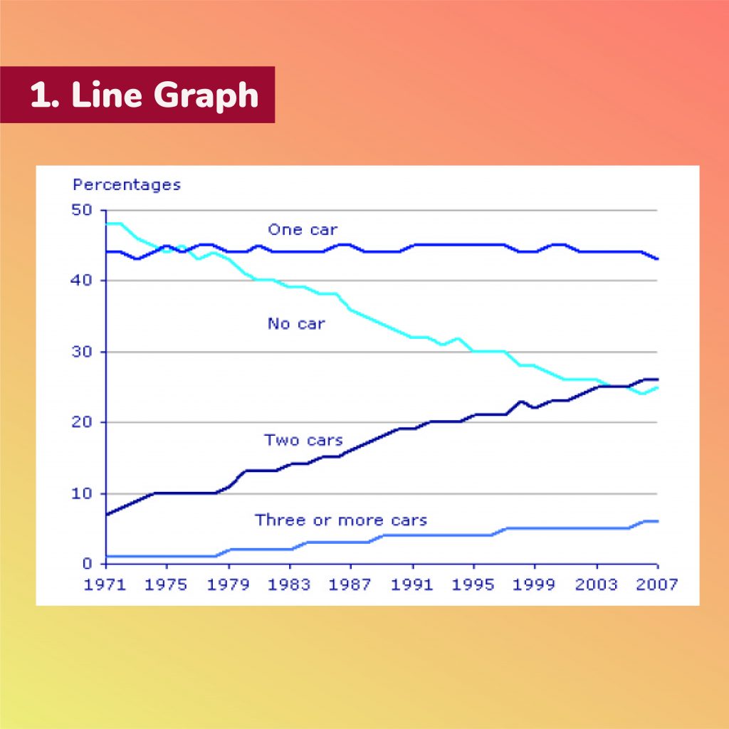
The graph gives information about car ownership in Britain from 1971 to 2007.
? ️? ️?
The graph illustrates the proportion of cars used by households in Great Britain during a 36-year period from 1971 to 2007.
Overall, the percentage of households who owned cars in Britain increased between 1971 and 2007. In addition, the number of households with two cars increased while the number of households without a car decreased rapidly.
Great Britain saw a steady increase in car ownership during a 20-year period. In 1995, 20% of British families owned two cars while the figure for using three or more cars was about 6%. During the same period, the percentage of families with no car decreased sharply from 48% to approximately 25%.
From 1999 to 2007, there was an increasing number of families who purchased two cars and three or more cars, with 28% and 8%, respectively. Meanwhile, families with one car still made up the majority for the whole line graph, but their percentage dropped slightly to 42% in 2007.
158 words
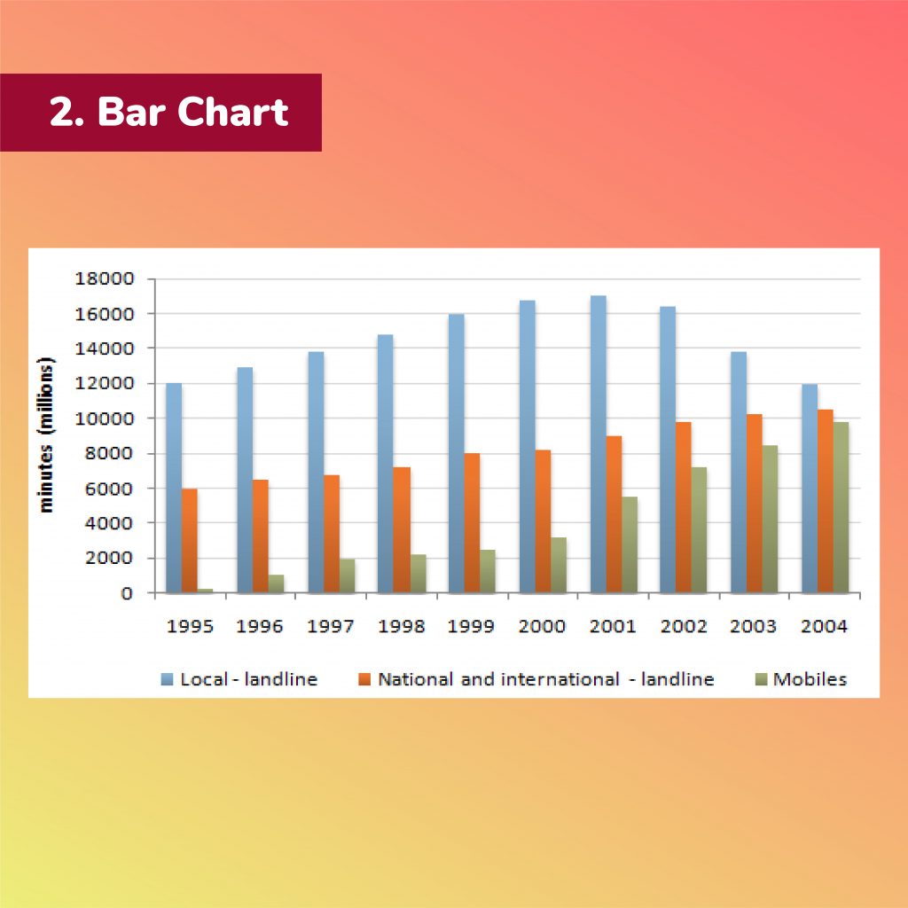
The chart shows the total number of minutes (in billions) of telephone calls in the UK, divided into three categories, from 1995 – 2002.
? ️? ️?
The bar chart compares different types of telephone calls in the UK in terms of a total number of minutes from 1995 to 2000.
Overall, while local-fixed line gained the most popularity in the UK, there was an upward trend in the number of minutes spent on three categories of phone calls.
With regard to local-fixed line, the number of minutes increased between 1995 and 1998, rising from more than 70 billion to just under 90 billion. It reached a peak of 90 billion in the following year before experiencing a drop of nearly 20 billion throughout the remainder of the period.
There was a gradual growth in the figure for national and international – fixed line during the 7-year period, from about 38 billion to approximately 61 billion shown. Similarly, mobiles saw the number of minutes go up considerably from around 3 billion in 1995 to reach the highest point of almost 45 billion in 2002. It is noticeable that the number of minutes spent on mobiles in the year 2002 was nearly three times as high as that in 1999.
181 words
The charts show the reasons why people travel to work by bicycle or by car.
Summarise the information by selecting and reporting the main features, and make comparisons where relevant.
? ️? ️?
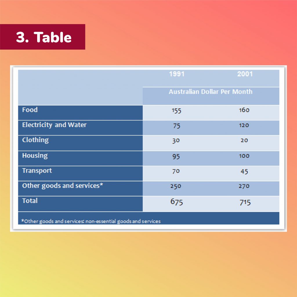
The chart illustrates the changes in spending pattern of an average Australian household over two separate years 1991 and 2001.
Overall, the expense in 2001 was slightly higher than in 1991 but it is different between six categories. While food and non-essential goods and services accounted for the greatest proportion of expenditure, clothing and transportation seem to receive the least investment.
According to the table, there was a significant increase in electricity and water spending over a 10-year period, from 75 to 120 Australian dollars per month. The amount of money distributed in food, housing and other goods and services, on the other hand, just marked a slight rise of 5AUD, 5AUD, and 20AUD respectively.
Compared with these growths, however, clothing and transport spending showed a downward trend. Australians paid a small sum in dressing up, of which figure fell from 30AUD to 20AUD. Transport cost even saw a dramatic decrease, from 70AUD in 1991 to only 45AUD in 2001.
158 words
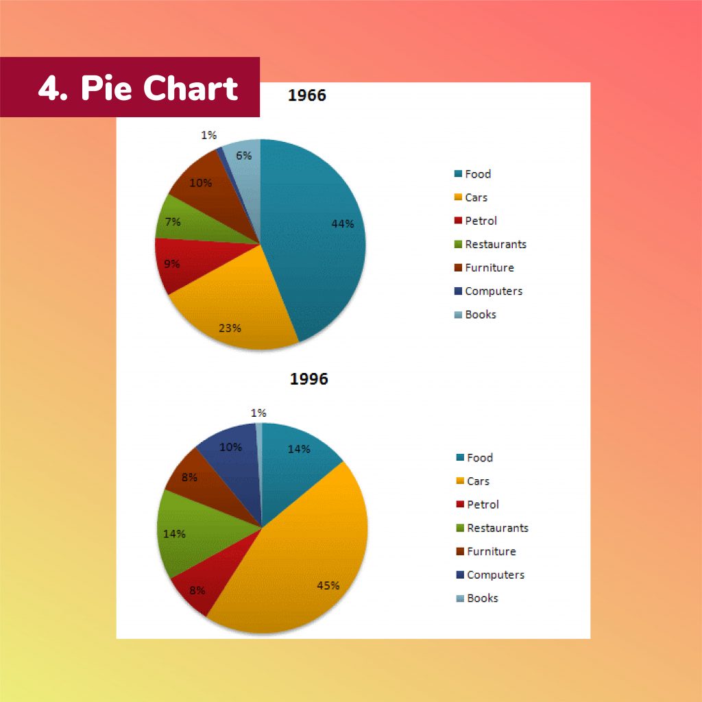
The given pie charts compare the expenses in 7 different categories in 1966 and 1996 by American Citizens.
Write a report for a university lecturer describing the information.
You should write at least 150 words.
You should spend about 20 minutes on this task.
? ️? ️?
The pie charts compare the expenditure on 7 certain categories by American citizens in 1966 and 1996.
Overall, the figures showed that the Americans spent more amount of money on food and cars than other remaining items in both years. Nevertheless, there were numerous changes in American people’s expenses from 1966 to 1996.
In the year 1966, food and car are two goods that the citizens mostly used their budget to purchase, at about 44% for food and 23% for car. In contrast, people are less likely to spend on 4 other categories with similar percentages, including 9% on petrol, 7% on restaurants, 10% on furniture and only 6% on books. Likewise, computers were the least expensed categories by exactly 1% in 1966.
In 1996, the figures for car expenditure/ spending increased by twofold at 45% compared to that in 1966. On the contrary, the consumption of food decreased dramatically to 14% and was equal to that of restaurants, which jumped double since 1966. Meanwhile, the proportion of two categories, petrol and furniture almost stayed the same, at 8% for both. Another visible trend was that the computer expenditure surged to 10% while that of books dropped to 1%.
199 words
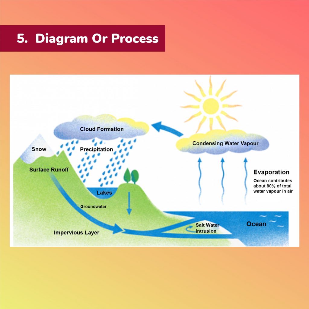
The diagram shows the water cycle, which is the continuous movement of water on, above and below the surface of the Earth.
? ️? ️?
The diagram which has been presented illustrates the circulation of the water on, above and below the Earth’s surface.
From an overall perspective, there are three main stages shown on the diagram. Ocean water evaporates, falls down as rain and finally flows into the ocean again.
To begin with, in the evaporation stage, we can realize that the vast majority of water vapor in the air stemming from the ocean. The heat of the sun makes water evaporate, then water vapor forms clouds. At the second procedure, water vapor condensing in the cloud falls as rain or snow.
Eventually, rainwater has several ways to turn back into the ocean. It can fall down and create the lakes; otherwise, water returns to the ocean by osmose via surface runoff. In the other way, the flow of rainwater may filter through the ground and then reach the impervious layer of the planet. After the salt water intrusion is shown to take place, groundwater returns into the ocean and ends the process of circulation.
172 words
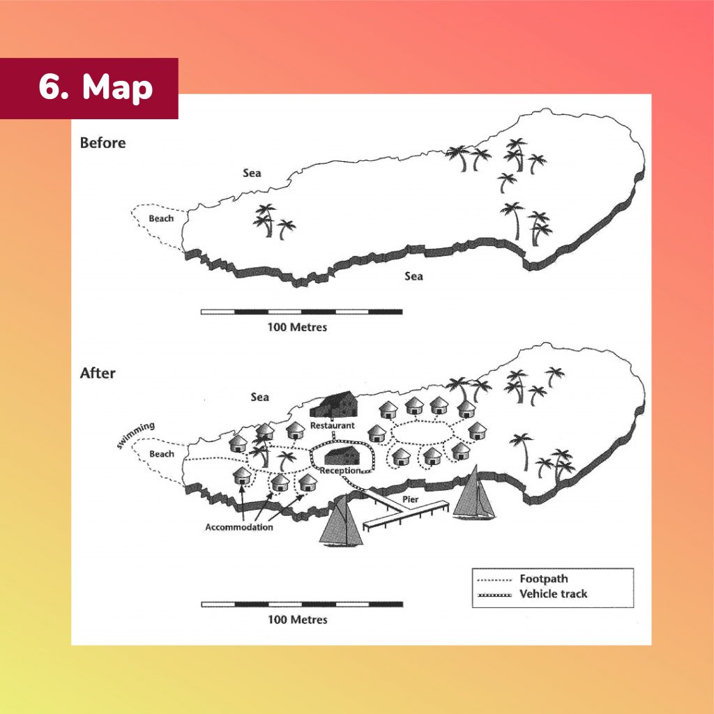
The two maps show an island, before and after the construction of some tourist facilities.
Summarise the information by selecting and reporting the main features, and make comparisons where relevant.
? ️? ️?
The maps illustrate the transformation of the changes of an island before and after being facilitated with many tourist amenities.
Overall, it is obvious that the island becomes more modern with a variety of resorts and aquatic entertainment facilities equipped/ installed.
Before the construction, the area seems quite peaceful and tranquil to be surrounded by sea and covered with several trees. Meanwhile, there is would be a small beach to the west of the island. All of these figures in the observed region have remained unchanged over the reconstruction period.
After being converted into a tourist destination, many houses are designed within the area for accommodation. Especially, they are connected with one another by a number of route systems, including footpath for pedestrians and vehicles for walking and for roadway vehicle. It is of note that there are also a new restaurant and a reception located in the central island.
Surrounding the area, more activities are activated in the coastal position, required to facilitate several essential equipment/ constructions, such as pier and sails nearby the shore.
176 words
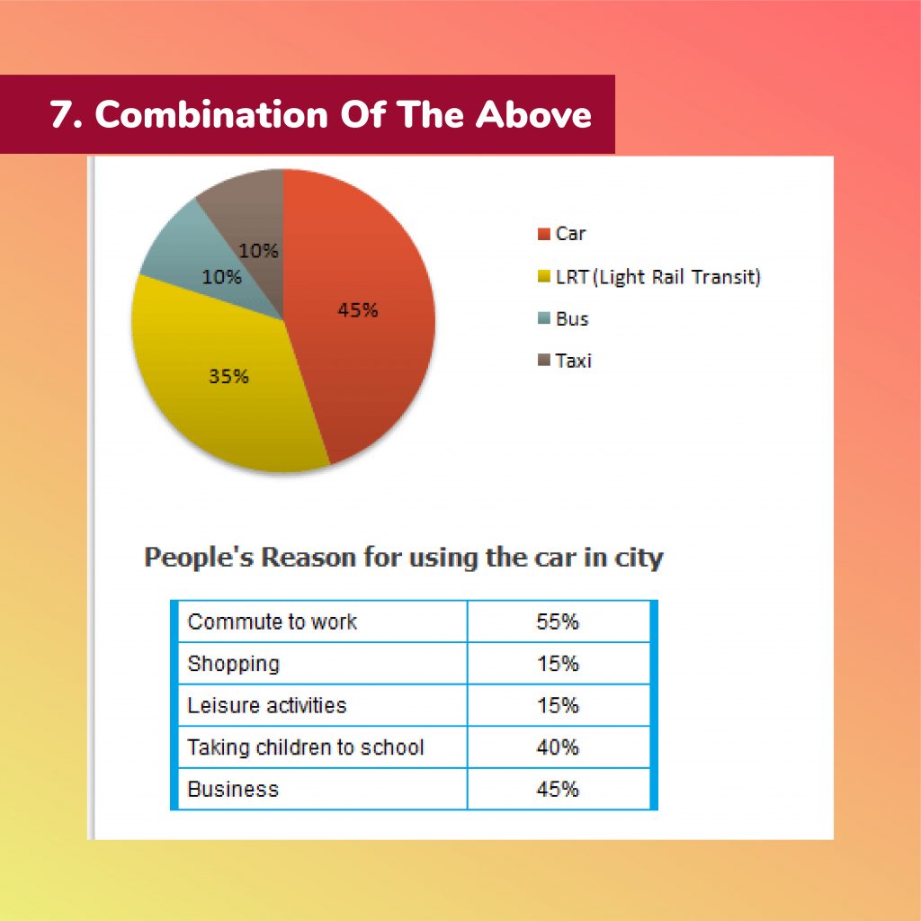
The diagrams give information on transport and car use in Edmonton.
Summarise the information by selecting and reporting the main features, and make comparisons where relevant.
? ️? ️?
The given charts illustrate data on the percentages of different means of transportation and purposes for using cars in Edmonton.
Overall, car and LRT (Light Rail Transit) are the most popular means of transportation in the area whereas the majority of people use the car to commute to work.
In particular, the proportion of commuters driving cars account for 45%, nearly a half of the total percentage of commuters. Meanwhile, the rate of people choosing LRT makes up 35%, which is 10% less than the figure for cars. Bus and Taxi share the same percentage of merely 10% of users.
As for the car using purpose, commuting to work becomes the primary reason, with 55%, while 45% of city dwellers drive their cars for business and 40% of citizens use cars to take their children to school. The proportions of people drive for shopping and leisure activities are precisely the same, at a negligible 15% for each reason.
158 words
Hy vọng những chia sẻ trong bài viết này đã giúp bạn có đáp án cho câu hỏi “luyện Writing IELTS như thế nào?” Nếu bạn có nhu cầu đăng ký một khóa học IELTS cấp tốc để nâng cao band điểm cho mình hoặc một lộ trình luyện thi ielts 6.5 một cách rõ ràng thì hãy tới ngay với TOEIC IELTS HUY TRỊNH. TOEIC IELTS HUY TRỊNH mang tới cho bạn một lộ trình học hợp lý, khoa học, đảm bảo cho bạn đạt hiệu quả cao nhất trong quá trình ôn luyện Writing IELTS.